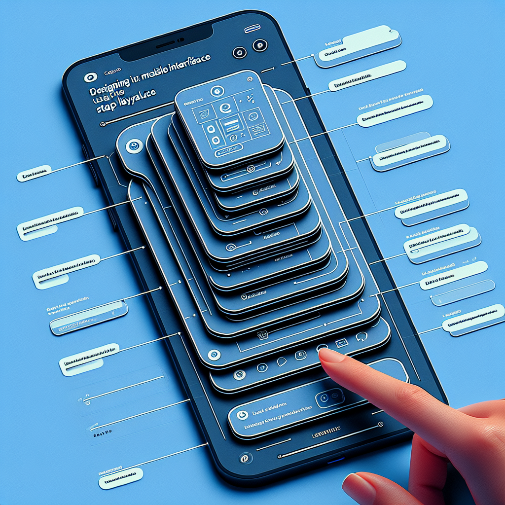
Introduction to Stack Layouts
As mobile device usage continues to soar, the need for intuitive and user-friendly mobile interfaces has never been more crucial. One effective way to enhance user experience (UX) is through the implementation of stack layouts. This method of organizing content can significantly simplify navigation and improve overall usability.
What Are Stack Layouts?
Stack layouts are a type of design framework where content is organized in a linear fashion, either vertically or horizontally. This layout is particularly useful for mobile interfaces as it reflects the natural scrolling behavior of users. By stacking elements on top of each other, designers can create a clear and logical flow of information.
Benefits of Stack Layouts
- Simplicity: Stack layouts provide a straightforward way to display content, making it easier for users to understand and interact with the app.
- Consistency: Maintaining a consistent layout throughout the app ensures a smooth and predictable user experience.
- Scalability: Stack layouts are highly adaptable, making it simple to add or remove elements without disrupting the overall design.
- Accessibility: By keeping the layout simple and intuitive, stack layouts make apps more accessible to users with varying levels of tech-savviness.
Implementing Stack Layouts
Vertical Stacking
Vertical stacking involves placing elements on top of each other, creating a column-like structure. This is particularly effective for mobile screens, which are naturally taller than they are wide. Common uses for vertical stacking include lists, feed-based content, and forms.
Horizontal Stacking
Although less common than vertical stacking, horizontal stacking places elements side by side. This is useful for displaying content that needs to be compared side by side, such as product features or pricing plans. However, horizontal stacking should be used sparingly to avoid overwhelming the user with too much information at once.
Responsive Design
One of the key advantages of stack layouts is their inherent responsiveness. Because elements are organized in a linear fashion, they naturally adjust to different screen sizes and orientations. This makes it easier to create a seamless experience across a variety of devices.
Best Practices
- Prioritize Content: Place the most important elements at the top of the stack to ensure they are seen first.
- Use Whitespace: Don’t overcrowd your layout; use whitespace to separate elements and make the design more readable.
- Keep It Consistent: Use a consistent stacking method throughout the app to avoid confusing the user.
- Test Extensively: Conduct usability testing to ensure your stack layout achieves the desired user experience.
Conclusion
Stack layouts offer a powerful and flexible way to design intuitive mobile interfaces. By organizing content in a clear and logical manner, you can significantly enhance the user experience and create a more accessible app. Whether you are designing a new app or revamping an existing one, consider implementing stack layouts to simplify UX and improve overall usability.

